Friday 31 July 2009

Yvonne Niewerth.


German graphic designer, Yvonne Niewerth was the topic of my most recent article for Chic Today. She's come up with the compelling concept of designing 30 different pudding packages for "every kind of pudding buyer" - - as you can see in the image directly above. As you will know if you read my article, this was done on the premise that we purchase in line with our identity, so by giving consumers a range of possible packaging designs, people are more able to express their image. Really interesting stuff, but I'm still unsure whether I think it would ever work - although it's obvious that I think package design is extremely important and more influential on purchases than we're ever conscious of.
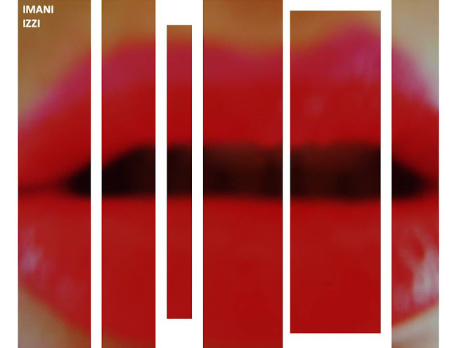
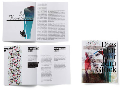
Putting these psychological constructs aside, I did some research into Niewerth's design work, and I really love her stuff. On her portfolio, there's a lot of work on books - really nice type and design within books -- I mean I don't know what these books are about, because my German isn't great (embarrassing memory flooding back, from when I said "ich heisse Tiddles" in German class...incorrect translation obv). I love this layering that can be seen in the web page of the top image. I'm starting to see this more and more - a kind of creative way of showing various examples of work than can be manipulated around the page. I love it. I love her feminine style, with the layering (again), the watercolour-esque tones and blotched textures, and the lovely fine type. I'd say lady-like yet edgy. A style I really am drawn to - - and irrespective of whether I think that having copious amounts of choice in pudding pack aesthetics is a good idea, the designs themselves are brilliant. I've been giving it a great deal of thought.. and I THINK I'd pick the black and white on the second row... or the colourful block type situation next door (even though I'm slightly over that type, it looks SO cool) - - so I wonder what that says about me..

Wednesday 29 July 2009

Hey.


Heyyyy. I'm sure Hey Design is French? I'd seen their stuff on Typographic Posters, but saw more of their work on lookslikegooddesign. I like it. I like it a lot. Lovely illustrations, connecting and telling a story. I don't know what story.. but I always think that sequences conjoined or in a big interconnected web means that there is a story being told.. does that make sense? The top image is my fav. Great use of colour and I love the symmetry. That's all my brain will permit me to say.

In other news, I'm hoping to get an article published this week for Canvas Magazine which is EXCITING. Aside from that, my life is a dissertation hell -- that i sporadically punctuate with writing, blogging and wine. AND I've started knitting. It's a slippery slope.

Wednesday 22 July 2009

Dripping in Chanel.


This week, Ariston Anderson wrote an article for Cool Hunting about this lavish stunt. This painted Chanel logo was dripping off the Hong Kong flagship Armani store, by none other than ZEVS - - - as part of his 'Liquidated Logos' show in Hong Kong. Apparently it is to symbolise the war of brands. I'm going to back out of moral/intelligent discussion about the rights or wrongs of this - because my brain can't take it alongside the billion words I have to write for my literature review today. Basically, the reason I am blogging about this is because I think Zevs is very profound and worth talking about, when he does crazy stuff like this, getting fined hundreds of thousands of pounds to make his point, but more so because the Chanel logo is my favourite logo of all time, and always will be. When I got interviewed last summer to do work experience at Pearlfisher, I was asked what my favourite identity was and why. There was no doubt in my mind. CHANEL. Those two interlinking Cs, simple, classic, timeless. But SO much more than that. A logo is a representation of a brand, so I guess without what Coco Chanel created, the logo wouldn't mean the same thing to me. But this impacting logo denotes independence, style, elegance and and the beauty of simplicity.

As much as I'm sure Coco Chanel wouldn't like her logo dripping off and Armani wall, I just thought I'd blog to show what lengths some people to go for their art, and to show my love of Chanel.


Installation, 2007, Zurich.

Tuesday 21 July 2009

Gotta get you into my life.


Alexander McQueen - stop it.

Sunday 19 July 2009

Deubal.


Tonight I've been watching a great film called Hors de Prix - or Priceless, featuring Audrey Tautou. I love this film, it's so incredibly chic. It denotes the height of decadence and the fashion is unreal. One thing that makes this film what it is, is the illustration on the credits. I found out tonight that it was designed by Stéphanie Lelong and Olivier Marquézy, of French creative agency Deubal. They have created some really lovely animated illustrations for both TV and film in France, they are all playful but really clever too.

I love the beautiful fine lines in this series of illustrations, and the fluid motion of everything interlinking. The flashes of colour against the monochrome backdrop is fabulous and it's just so elegant and so..French!

Saturday 18 July 2009

Scarborough.


This isn't the most apt title I could have chosen for my post. Scarborough isn't an endless series of run down infrastructure. But that's where these photos were from. I don't know what my obsession is with shitty walls and peeling paint, but I just love it. These shots are pictures of pictures, because I haven't yet got a digital body for my SLR My friend Chrissy and I sometimes take our cameras and ponder around the town, trying to snap various examples of decay. She's quite into graffiti as well, but I'm more about the stuff you see above. Call me strange, but I just find it really beautiful.

Friday 17 July 2009

Maggie Shaffer.

I was thinking today - all I blog about is men men men, and it's just not on - women are meant to be the ones with the more active creative side of the brain - and there are many ladies out there with talent. SO I thought I'd showcase the illustrations of a friend of mine. I always stalk her for her illustrations she puts up on facebook, I love her stuff, she's very talented. I like the illustrated quote too, it's definately food for thought with regard to where creativity stems from in us.

Speaking of talented women - I'm listening to Suzanne Vega whilst I do my writing tonight. I forgot how great she was. Amazing. I have ridiculous music taste for a 22 year old. I love 80s - and I blame my local radio station who have a late night show called 'the wind down zone'. It's out of this world. I'm not ashamed.


Thursday 16 July 2009

Non Format.


Non Format
is an agency you have to give your respect to. Their work pushes every boundary in my mind, and it's obvious that they are imitated by many. Their typography is soooo progressive and innovative, I get really passionate about it. This example was for Fader Magazine. It's a "typographic interpretation of the lyrics for Where Are They Now by Nas." It attracted me not only on an aesthetic basis, but also because of the fact it was an interpretation of something auditory. It's really interesting to think that you can cross boundaries of your senses; showing something that you hear, through design.

Cam Diamond.


True fact: I had an uncle called Diamond (I've linked in proof - - of course, he was an ice cream man). I like telling this story, as people always look at me like I must belong to some kind of mafia family.

Anyway, I was feeling very monochrome today - and although Cam Diamond does a lot more than black and white - I love these pieces. There's always something so impacting and bold about just using black and white - which has reminded me to also blog about some Non Format stuff I've seen. Cam Diamond's posters are nicely abstract, with illustrative type thats just gorgeous.

Cam Diamond is a designer for Lee and Wrangler, and runs a creative studio covering all mediums. It excites me when i read the studio runs from "illustration to installation" - - - it must be a seriously cool place.

Tuesday 14 July 2009

Shoe Lust.


I just wanted to dedicate a post to Henry Holland - Henry, I love your Pradas. Amaze.

Monday 13 July 2009

Jon Burgerman.


Today I was in Urban Outfitters, and after being unsuccessful with my try-ons, I waited on the sofa for my friend. Amongst the books was this - Pens are my Friends, by Jon Burgerman.
Inside was doodle upon doodle - really cool stuff, great use of colour and really comical and fantastical illustrations. Not my normal style, but I really enjoyed flicking through the pages of this little shiny scribble bible. When I went on his website, it told me that his book signing for this book was actually yesterday in NYC! What a coincidence!
I like the nature of doodles, especially from this brilliant illustrator, as he states inspiration can be found everywhere - this tells me that his work is extremely varied and he draws from all areas of life and his surroundings, which is very very cool - drawing a line from life to paper. He also does 3D work and animations which are equally as compelling, visually.
Here are Jon's tips on how to be a doodle wizard:
"Doodling is a hard master if you want to take it seriously, it’s a piece of pie if you just want to mess around though. Always sharpen your pencils and keep your desk tidy. Carrying a sketchbook with you at all times is useful, though you have to remember to draw in it once in a while".

Craig McDean.


Craig McDean's photography blows my mind. British born fashion photographer. Previously featured in some of my favourite magazines (e.g. i-D, VOGUE). He has photographed for some of the best designers, and celebrities - some stunningly creative celebrity shoots (see above). Now McDean lives in New York and is represented by Art + Commerce.

I love the playful creativity McDean relays. His shots are so edgy and they compel you to look at every detail. Constantly thinking outside the box, in my opinion, he has the ability to convey motion, feeling and character through his work. Consequently making a statement that has a powerful meaning. FIERCE.

Saturday 11 July 2009

Nod Young.


I found this set of Nod Young's illustrations on Flickr. This is the caption that was under the image immediately above:
I am a follower of Buddhism and believe that creativity can be derived from its teachings. This work is a typographic interpretation of two poems quoted from the original Zen classic, The Platform Sutra of the Sixth Patriarch, that dates back almost 1500 years ago. The poems teach us not to believe all that which exists, not even the reflection of ourselves in a mirror. The caveat is for us to teach ourselves to overcome the rules and boundaries of our existence in order to reach a state of Zen, unfettered by the perceived limitations of life.

I found this absolutely fascinating. I think it's vital to look to different countries, cultures and religions, because all have so many different things to give and different interpretations of the world and life. This year, doing my Masters, I have had the pleasure of meeting amazing people from all over the world, and it's taught me so much. I have a lot of Taiwanese friends, and it is obvious that their culture and religion is very different to mine personally. They are more relaxed and at peace, by no means submissive - but certainly more placid and serene than the Indian, Greek, British, Russian etc students. I have to say they are some of the nicest, kindest people I've ever met.
It's interesting to translate this culture into design. Nod Young states that it is hard to have complete creative freedom, because we're too concerned with aesthetics and meaning. Which really got me, because, of course, that's totally right. But I'm sat here struggling, because when I look at a piece of work, they are the two things I think about. I think that's totally natural, but this has really made me think about creativity as a more fluid concept. Maybe if I created something without thinking at all about how it looked, or why I was doing it, it could actually end up having more meaning than something calculated. I think this way of thinking can help really push the boundaries of creativity.

Friday 10 July 2009

Simon Bent.


Simon Bent, I like your style. I really really do love looking at this. This typography, named 'Hoax' is, and I quote, "an exploration of modern/western typeface". It's quite interesting to get the fine line of the type, with graphic additions, which add a boldness. The colours used here have a lot to do with my attraction. Really gorgeous use of colour - obviously fitting with the heart theme. As is evident, I'm driven by typography that really goes towards illustration, with intricate (a word I use a lot) detail. I love the O and the Q in the set - it's weird, but I almost feel like they are extra-circular. I find work like this very refreshing and original - I am getting really bored of blocked out type -- that in the strain of stencil etc. I did love it, but it's been used so many times, and it's really nice to see something pushing the boundaries in other directions.

Thursday 9 July 2009

FutureClaw Magazine.


(Close up of above page.. GORGE textures!)


FutureClaw is a really cool mag, from Vermont - USA. What attracts me to this arts/culture/fashion publication, is it's apparent size. I know it's said that size doesn't matter - but come on - it helps. FutureClaw measures a hefty 12 x 15 inches (a normal fashion mag measures 8.5 x 11)and apparently contains pages of luscious glossy high quality paper (I wouldn't know, as I've only read the digital version). I love the concept of a broadsheet arts mag, as I feel it would very much add to the experience. As you can see by the pictures I've added, the layouts are really edgy, incorporating artistically driven shoots, with pages that are pure texture (my favourite). The content is very interesting and progressive.


Speaking of cool magazines, I am really enjoying my internship at Chic Today, I have so much to learn, but I am loving coming up with new ideas each week, and having direction on what I need to do to produce a catchy, well-written article. My second article got published this morning, which is on Le Whif - chocolate you inhale instead of eat!

Wednesday 8 July 2009

Andrei Robu.


Andrei Robu. Exceptional. Designer and Partner at Acme, design office in Bucharest, Romania (copied from his Twitter account.. I'm such a crafty stalker). When I came across the work of Andrei Robu, I was booowwwlllled over. What gorgeous work. His typography is playful and inventive. There's some stunning work with translucent overlapping colours on his site, like the example above - I recommend viewing it. The examples I selected to show you were.. surprisingly.. my favourite pieces. I could look at them forever - how serene, how delicate, how BRILLIANT. Beautiful use of colour, layering, composition and detail. Andrei - blow your cig on me, I'm yours.


(All images are from the artist's website, as always)

Monday 6 July 2009

Jo Cecil. Queen of Hearts.


My gorgeous friend Jo developed this set of photography for her final year exhibition when studying Performance Art at Central School of Speech and Drama. As well as developing the concept, she's also the model. Her work is inspired by Anna Gaskall - who I'd never heard of before, but her photography concentrates a lot on Alice in Wonderland, beautifully whimsical yet laced with a hint of sinister. I think photography like this is really special - because you have to have the talent to tell that story through a static image (but arguably all photography is trying to tell a story of some form).
Jo's work centres on The Queen of Hearts from Alice in Wonderland. A character that wikipedia tells me is a "foul-tempered monarch" (look at Jo's eyes of venom in the second photo). The verdant, earthy toned landscape contrasts superbly against her bold monochrome form, like plucking the character from a cartoon and landing her in a forest. The hints of red against the blacks and whites are just so gorgeously feminine, but it’s still maintained that there is anger bellowing through (again, reference to the second image).
The element that I am most in love with is something I find hard to put into words. I felt it the first time I watched The Virgin Suicides, and I feel it with this – it’s a freshness that is mixed with something nostalgic and old. I think the lighting has a lot to do with it. I wish I knew how to describe it! I think these photographs are absolutely stunning.
Paris Paris