Showing posts with label Illustration. Show all posts

Sunday, 8 May 2011

Bella Towse


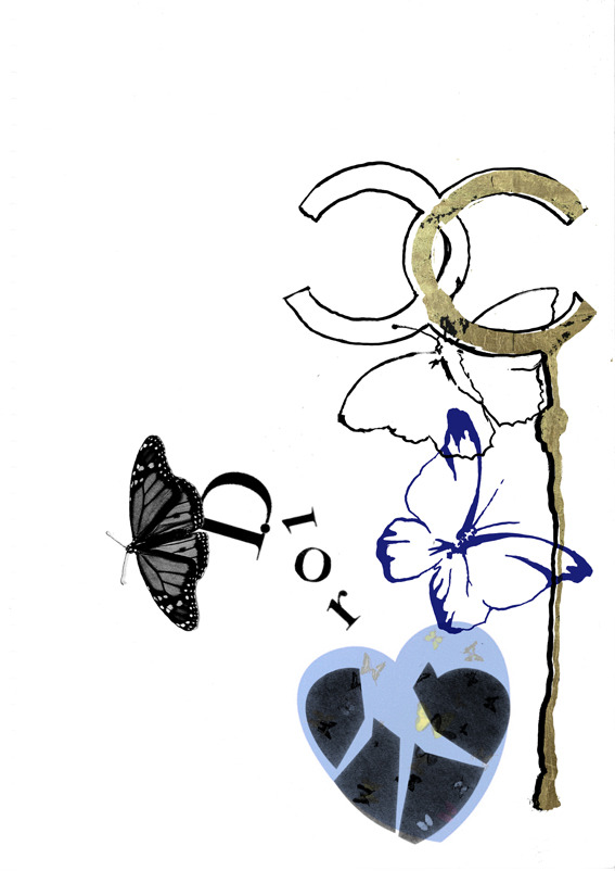
Bella Towse is a London based illustrator and Visual Planner at Pearlfisher - where I have done quite a bit of work experience, researching trend insights. Bella also did a gorgeous illustration (love heart above) for one of my column articles for Nutrition Rocks. I love Bella's style. She uses layers, colour and composition to create really inventive constructions that are both exciting and abstract. There are more illustrations on her website - showing her drawing skills as well as mixed media like the pieces above.

Wednesday, 25 November 2009

alberto seveso.


When I saw Frankmusik's album art, I was really intrigued with the gorgeously original illustrations. Looking on an illustration site the other day, I found who did it - Alberto Seveso.

Reading about him, I found out that he has never studied anything related to graphic design or illustration. I find this really interesting because recently I've been thinking about whether creative talent can be learnt or whether it's innate. Obviously this is proof that you have to have it in you - because his work is not only amazing, but truly inspiring and unique.

He merges black and white photos with beautifully abstracted illustrations - a method called 'sperming'.. I love the way that it almost looks like the body's internals are exposed, showcasing a series of beautiful curves and shapes embodying a plethora of possibilities: organs, bones, veins, flowers, etc. Each human figure is injected with an imaginative burst of visually compelling forms to create something incredibly fresh and I haven't seen anything like this before! Gorgeous! Forza Alberto!

Wednesday, 29 July 2009

Hey.


Heyyyy. I'm sure Hey Design is French? I'd seen their stuff on Typographic Posters, but saw more of their work on lookslikegooddesign. I like it. I like it a lot. Lovely illustrations, connecting and telling a story. I don't know what story.. but I always think that sequences conjoined or in a big interconnected web means that there is a story being told.. does that make sense? The top image is my fav. Great use of colour and I love the symmetry. That's all my brain will permit me to say.

In other news, I'm hoping to get an article published this week for Canvas Magazine which is EXCITING. Aside from that, my life is a dissertation hell -- that i sporadically punctuate with writing, blogging and wine. AND I've started knitting. It's a slippery slope.

Sunday, 19 July 2009

Deubal.


Tonight I've been watching a great film called Hors de Prix - or Priceless, featuring Audrey Tautou. I love this film, it's so incredibly chic. It denotes the height of decadence and the fashion is unreal. One thing that makes this film what it is, is the illustration on the credits. I found out tonight that it was designed by Stéphanie Lelong and Olivier Marquézy, of French creative agency Deubal. They have created some really lovely animated illustrations for both TV and film in France, they are all playful but really clever too.

I love the beautiful fine lines in this series of illustrations, and the fluid motion of everything interlinking. The flashes of colour against the monochrome backdrop is fabulous and it's just so elegant and so..French!

Friday, 17 July 2009

Maggie Shaffer.

I was thinking today - all I blog about is men men men, and it's just not on - women are meant to be the ones with the more active creative side of the brain - and there are many ladies out there with talent. SO I thought I'd showcase the illustrations of a friend of mine. I always stalk her for her illustrations she puts up on facebook, I love her stuff, she's very talented. I like the illustrated quote too, it's definately food for thought with regard to where creativity stems from in us.

Speaking of talented women - I'm listening to Suzanne Vega whilst I do my writing tonight. I forgot how great she was. Amazing. I have ridiculous music taste for a 22 year old. I love 80s - and I blame my local radio station who have a late night show called 'the wind down zone'. It's out of this world. I'm not ashamed.


Thursday, 16 July 2009

Cam Diamond.


True fact: I had an uncle called Diamond (I've linked in proof - - of course, he was an ice cream man). I like telling this story, as people always look at me like I must belong to some kind of mafia family.

Anyway, I was feeling very monochrome today - and although Cam Diamond does a lot more than black and white - I love these pieces. There's always something so impacting and bold about just using black and white - which has reminded me to also blog about some Non Format stuff I've seen. Cam Diamond's posters are nicely abstract, with illustrative type thats just gorgeous.

Cam Diamond is a designer for Lee and Wrangler, and runs a creative studio covering all mediums. It excites me when i read the studio runs from "illustration to installation" - - - it must be a seriously cool place.

Monday, 13 July 2009

Jon Burgerman.


Today I was in Urban Outfitters, and after being unsuccessful with my try-ons, I waited on the sofa for my friend. Amongst the books was this - Pens are my Friends, by Jon Burgerman.
Inside was doodle upon doodle - really cool stuff, great use of colour and really comical and fantastical illustrations. Not my normal style, but I really enjoyed flicking through the pages of this little shiny scribble bible. When I went on his website, it told me that his book signing for this book was actually yesterday in NYC! What a coincidence!
I like the nature of doodles, especially from this brilliant illustrator, as he states inspiration can be found everywhere - this tells me that his work is extremely varied and he draws from all areas of life and his surroundings, which is very very cool - drawing a line from life to paper. He also does 3D work and animations which are equally as compelling, visually.
Here are Jon's tips on how to be a doodle wizard:
"Doodling is a hard master if you want to take it seriously, it’s a piece of pie if you just want to mess around though. Always sharpen your pencils and keep your desk tidy. Carrying a sketchbook with you at all times is useful, though you have to remember to draw in it once in a while".

Saturday, 11 July 2009

Nod Young.


I found this set of Nod Young's illustrations on Flickr. This is the caption that was under the image immediately above:
I am a follower of Buddhism and believe that creativity can be derived from its teachings. This work is a typographic interpretation of two poems quoted from the original Zen classic, The Platform Sutra of the Sixth Patriarch, that dates back almost 1500 years ago. The poems teach us not to believe all that which exists, not even the reflection of ourselves in a mirror. The caveat is for us to teach ourselves to overcome the rules and boundaries of our existence in order to reach a state of Zen, unfettered by the perceived limitations of life.

I found this absolutely fascinating. I think it's vital to look to different countries, cultures and religions, because all have so many different things to give and different interpretations of the world and life. This year, doing my Masters, I have had the pleasure of meeting amazing people from all over the world, and it's taught me so much. I have a lot of Taiwanese friends, and it is obvious that their culture and religion is very different to mine personally. They are more relaxed and at peace, by no means submissive - but certainly more placid and serene than the Indian, Greek, British, Russian etc students. I have to say they are some of the nicest, kindest people I've ever met.
It's interesting to translate this culture into design. Nod Young states that it is hard to have complete creative freedom, because we're too concerned with aesthetics and meaning. Which really got me, because, of course, that's totally right. But I'm sat here struggling, because when I look at a piece of work, they are the two things I think about. I think that's totally natural, but this has really made me think about creativity as a more fluid concept. Maybe if I created something without thinking at all about how it looked, or why I was doing it, it could actually end up having more meaning than something calculated. I think this way of thinking can help really push the boundaries of creativity.

Sunday, 21 June 2009

Don't Panic.


Apologies for the horrendous images, I have a major case of shaky hand!
When walking down the street, we all live in fear of the skin crawling-ly irritating humans standing in the way, with a pile of shitty pieces of paper - trying to flog them to whoever comes within a 5 metre radius, or in fact whoever makes eye contact with them. As soon as you make that pivotal mistake, they have their claws in - they pace forward, with paper in hand - trying to shove it into any oraphis available on your person. Bain of my actual life. I have been known to get quite irate when I'm on the phone in a rush, and there is a keeno trying to place leaflets under my arm or in my open mouth.
In conclusion - it can be said that these people, and their little pieces of paper are not liked. No one wants to know about a gig, or a club night through a piece of paper. People are too lazy to read it - keep it - remember about it. They end up on the floor, in the bin, or at best - at the bottom of your bag. In my eyes, it is NOT a successful marketing communications technique.
BUT then I came across these packs by Don't Panic. Really cool art work drew me in initially. A brown paper envelope with different abstract illustrations on every week, i became somewhat of a collector. Looking at the envelope, I thought it was going to be a goodie bag - alas it was brimming with loads of leaflets, but also with the nice addition of posters and stickers, which made it more palletable.
The people handing them out were obviously still not getting much luck, as when I showed an interest they practically kissed me on the forehead and asked me if I wanted 5.
But I really do think these packs are cool. I LOVE the artwork. Don't panic is a really quirky and cool publication company who's creative doodles compliment the world of alternative music and the like and make communications a little bit more aesthetically scintillating.

Wednesday, 22 April 2009

Spike Hibberd.


Thanks again Heavy Backpack - for introducing me to the wonderment of Spike Hibberd, a Graphic Designer/Art Director who's stuff is just gorgeous. I absolutely love his typography - so many more examples on his website - really creative and forward thinking, but with the ability to add a retro, and very personal touch to things - and as is said in his bio, he adds a bit of himself to everything he does. There is use of hand written scrawls (in a good way) that make his work look really idiosyncratic. I think his illustrative talent is profound - especially with the Mr Tulk poster. All in all - brilliant work on identity, typeography and general use of colour and illustration. AMAZING.

Sunday, 5 April 2009

Roanne Adams.


WELL. WELL Well well. This New York based designer runs a studio called TriBeCa. When I came across her website, I was just so excited. Look at her stuff!! I had about a billion images saved, but I just stuck to my absolute favourites. I LOVE IT. I just love it. It is SO fresh, and COOL and the use of colour is just so mellow yet effective, and the style is really....innovative and artistically driven. I cant really describe what I mean - I just wish more retail items looked more like this.

Thursday, 5 March 2009

Merandchik.


Amazing illustration by Merandchik, sourced from heavy-backpack. Really cool and imaginative illustrator but more than that, I really like the lay outs and poster designs. Really nice typeface on that poster above. on http://blog.merdanchik.com/ there's also some posters and shop interiors for a Russian store that I love.

Saturday, 28 February 2009

Illustrissimo.

I went on http://www.illustrissimo.com/ to look for some images for an illustrator - Margot Macé, who produces some brilliant stuff with watercolours with ink pen:

Photos: www.bookmargot.com


Trying to find stuff on Margot, I came across a site full of brilliant French illustrators. My favourite bit of this site was the typography illustrators.


Wandy Sinesi


I love the work of Come de Bouchony on this site:


I also really liked the work of Alex Trochut:


This work really reminds me of Alan Alridge's psychodelic graphics. I love it all so much, all the engergy and swirling styles of the type. It really creates interesting visuals and does very much relate to that era, with regard to illustration. I feel like I'm on drugs looking at it!
Paris Paris