Showing posts with label Package Design. Show all posts

Friday, 31 July 2009

Yvonne Niewerth.


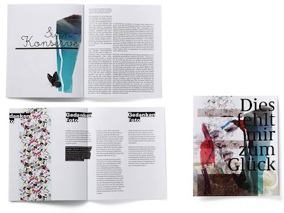
German graphic designer, Yvonne Niewerth was the topic of my most recent article for Chic Today. She's come up with the compelling concept of designing 30 different pudding packages for "every kind of pudding buyer" - - as you can see in the image directly above. As you will know if you read my article, this was done on the premise that we purchase in line with our identity, so by giving consumers a range of possible packaging designs, people are more able to express their image. Really interesting stuff, but I'm still unsure whether I think it would ever work - although it's obvious that I think package design is extremely important and more influential on purchases than we're ever conscious of.
Putting these psychological constructs aside, I did some research into Niewerth's design work, and I really love her stuff. On her portfolio, there's a lot of work on books - really nice type and design within books -- I mean I don't know what these books are about, because my German isn't great (embarrassing memory flooding back, from when I said "ich heisse Tiddles" in German class...incorrect translation obv). I love this layering that can be seen in the web page of the top image. I'm starting to see this more and more - a kind of creative way of showing various examples of work than can be manipulated around the page. I love it. I love her feminine style, with the layering (again), the watercolour-esque tones and blotched textures, and the lovely fine type. I'd say lady-like yet edgy. A style I really am drawn to - - and irrespective of whether I think that having copious amounts of choice in pudding pack aesthetics is a good idea, the designs themselves are brilliant. I've been giving it a great deal of thought.. and I THINK I'd pick the black and white on the second row... or the colourful block type situation next door (even though I'm slightly over that type, it looks SO cool) - - so I wonder what that says about me..

Tuesday, 12 May 2009

Album Art.


I was thinking (instead of revising) about album cover art - and how it's just the same as package design. I've never thought about it before - but it's true. I wonder whether the externals of a cd affects people in the same way it would with a costmetic product, for example. There are some really interesting album designs out there - but as its 1am in the MIDST of my revision hell - I have only collaged a few of my favourite covers at the moment. I included Hall and Oates as a joke. They are amazing, but it is a bit of a weird cover - as they are dripping in sweat. iffy.

Sunday, 19 April 2009

Bee Raw ...Bee autiful!


I was perusing the die line and came across THIS. A graphic design student has produced this for some honey sticks. What a honey stick is, I do not know (presumably a stick made out of honey). The main thing I like is how the student has crafted the packaging to look like honey comb. Its not overt, in the sense that it's not loads of little shapes interlinking, but at the same time it depicts that hexagonal form of the comb. Obviously, using this shape formation draws people's minds to honey, honey comb and so on when looking at the packaging, thus having that wonderful recall of all the glorious honey connotations by simply looking at a box, this is where my Psychology degree comes in handy - a sweeping statement, based on absolutely nothing I learnt. I love the colours, the gloss finish - again, reinforces that honey feel - bringing people's thoughts to the aesthetics and touch of honey. On top of all of this we have a gorgeous white typeface, bold and large across the packaging, with the image of the bee. I much prefer this to the black, as that is quite lost in the busy background. Really like the type not quite fitting and stretching over the surfaces, I think it makes it look really edgy.

Sunday, 5 April 2009

Roanne Adams.


WELL. WELL Well well. This New York based designer runs a studio called TriBeCa. When I came across her website, I was just so excited. Look at her stuff!! I had about a billion images saved, but I just stuck to my absolute favourites. I LOVE IT. I just love it. It is SO fresh, and COOL and the use of colour is just so mellow yet effective, and the style is really....innovative and artistically driven. I cant really describe what I mean - I just wish more retail items looked more like this.

Saturday, 4 April 2009

ruiz+company.


Spanish agency have done this package design for chocolat factory. I love it. I think its really impacting, with the bold use of block colour and simplistic type/design. I think this would really stand out amongst competitors and reminds me of some cool and minimalist confectionery design in the UK (look at pic below) and almost as simple as the new design for Tesco Value products, which I actually really like!


Friday, 27 March 2009

Alvin Chan.


Malaysian-born designer. Quite a lucrative spread of work, including branding, space design and graphics. Currently Design Director at Nike Europe in the Netherlands.
What attracted me: primarily the Nike branding and package design. Clean, sharp, powerful, bright yet muted tones. Adds good package design to a market that is normally brash, shiny and consisting of no graphical distinction. Love the blocked out typeface.

Origin of the Species poster graphics is my favourite design from Chan. Obviously - because there's a skull on there, so I'm instantly in love with it. The use of colour is very effective, with a typeface that really amalgamates with the theme. As I'm mostly interested by textures in design, I was really into this close up shot of the poster design. Here, you can really see the mottled effected on the skull, blended with whites and reds and all the shades in between. I love the ability of something 2D to look as if it's worth running your fingers across.

Paris Paris