Saturday, 11 July 2009

Nod Young.


I found this set of Nod Young's illustrations on Flickr. This is the caption that was under the image immediately above:
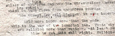
I am a follower of Buddhism and believe that creativity can be derived from its teachings. This work is a typographic interpretation of two poems quoted from the original Zen classic, The Platform Sutra of the Sixth Patriarch, that dates back almost 1500 years ago. The poems teach us not to believe all that which exists, not even the reflection of ourselves in a mirror. The caveat is for us to teach ourselves to overcome the rules and boundaries of our existence in order to reach a state of Zen, unfettered by the perceived limitations of life.

I found this absolutely fascinating. I think it's vital to look to different countries, cultures and religions, because all have so many different things to give and different interpretations of the world and life. This year, doing my Masters, I have had the pleasure of meeting amazing people from all over the world, and it's taught me so much. I have a lot of Taiwanese friends, and it is obvious that their culture and religion is very different to mine personally. They are more relaxed and at peace, by no means submissive - but certainly more placid and serene than the Indian, Greek, British, Russian etc students. I have to say they are some of the nicest, kindest people I've ever met.
It's interesting to translate this culture into design. Nod Young states that it is hard to have complete creative freedom, because we're too concerned with aesthetics and meaning. Which really got me, because, of course, that's totally right. But I'm sat here struggling, because when I look at a piece of work, they are the two things I think about. I think that's totally natural, but this has really made me think about creativity as a more fluid concept. Maybe if I created something without thinking at all about how it looked, or why I was doing it, it could actually end up having more meaning than something calculated. I think this way of thinking can help really push the boundaries of creativity.

Friday, 10 July 2009

Simon Bent.


Simon Bent, I like your style. I really really do love looking at this. This typography, named 'Hoax' is, and I quote, "an exploration of modern/western typeface". It's quite interesting to get the fine line of the type, with graphic additions, which add a boldness. The colours used here have a lot to do with my attraction. Really gorgeous use of colour - obviously fitting with the heart theme. As is evident, I'm driven by typography that really goes towards illustration, with intricate (a word I use a lot) detail. I love the O and the Q in the set - it's weird, but I almost feel like they are extra-circular. I find work like this very refreshing and original - I am getting really bored of blocked out type -- that in the strain of stencil etc. I did love it, but it's been used so many times, and it's really nice to see something pushing the boundaries in other directions.

Thursday, 9 July 2009

FutureClaw Magazine.


(Close up of above page.. GORGE textures!)


FutureClaw is a really cool mag, from Vermont - USA. What attracts me to this arts/culture/fashion publication, is it's apparent size. I know it's said that size doesn't matter - but come on - it helps. FutureClaw measures a hefty 12 x 15 inches (a normal fashion mag measures 8.5 x 11)and apparently contains pages of luscious glossy high quality paper (I wouldn't know, as I've only read the digital version). I love the concept of a broadsheet arts mag, as I feel it would very much add to the experience. As you can see by the pictures I've added, the layouts are really edgy, incorporating artistically driven shoots, with pages that are pure texture (my favourite). The content is very interesting and progressive.


Speaking of cool magazines, I am really enjoying my internship at Chic Today, I have so much to learn, but I am loving coming up with new ideas each week, and having direction on what I need to do to produce a catchy, well-written article. My second article got published this morning, which is on Le Whif - chocolate you inhale instead of eat!

Wednesday, 8 July 2009

Andrei Robu.


Andrei Robu. Exceptional. Designer and Partner at Acme, design office in Bucharest, Romania (copied from his Twitter account.. I'm such a crafty stalker). When I came across the work of Andrei Robu, I was booowwwlllled over. What gorgeous work. His typography is playful and inventive. There's some stunning work with translucent overlapping colours on his site, like the example above - I recommend viewing it. The examples I selected to show you were.. surprisingly.. my favourite pieces. I could look at them forever - how serene, how delicate, how BRILLIANT. Beautiful use of colour, layering, composition and detail. Andrei - blow your cig on me, I'm yours.


(All images are from the artist's website, as always)

Monday, 6 July 2009

Jo Cecil. Queen of Hearts.


My gorgeous friend Jo developed this set of photography for her final year exhibition when studying Performance Art at Central School of Speech and Drama. As well as developing the concept, she's also the model. Her work is inspired by Anna Gaskall - who I'd never heard of before, but her photography concentrates a lot on Alice in Wonderland, beautifully whimsical yet laced with a hint of sinister. I think photography like this is really special - because you have to have the talent to tell that story through a static image (but arguably all photography is trying to tell a story of some form).
Jo's work centres on The Queen of Hearts from Alice in Wonderland. A character that wikipedia tells me is a "foul-tempered monarch" (look at Jo's eyes of venom in the second photo). The verdant, earthy toned landscape contrasts superbly against her bold monochrome form, like plucking the character from a cartoon and landing her in a forest. The hints of red against the blacks and whites are just so gorgeously feminine, but it’s still maintained that there is anger bellowing through (again, reference to the second image).
The element that I am most in love with is something I find hard to put into words. I felt it the first time I watched The Virgin Suicides, and I feel it with this – it’s a freshness that is mixed with something nostalgic and old. I think the lighting has a lot to do with it. I wish I knew how to describe it! I think these photographs are absolutely stunning.

Sunday, 5 July 2009

Cornelia Parker.

Cornelia Parker is one of my favourite artists. I am always fascinated by art that looks at fragments, separating them and bringing them back together. Her abstracted interpretations of the world create some mesmerising pieces, and I love the amount of texture you get from them.

My favourite is Cold Dark Matter: an Exploded View - here Parker put household items in a shed and got the army to blow it up.. and with the fragments left from the destruction, she created the piece; suspending the particles from the ceiling with see through wire. I think it's amazing, and the shadows cast over the room add so much to the visual experience.


I was looking through my old A-Level art books earlier, and saw pictures of my attempt at a bit of Cornelia Parker. In my home town there is a derelict zoo and amusement park. It is now filled with bits of decaying wood, metal and mesh, there are some quite beautiful things up there (if you like that sort of thing). Anyway, my method wasn't as drastic as that of Parker - I just put some bits in a shoe box and took a hammer to it. I then hung the little fragments off a light fixture and took some pictures. The quality isn't that good on these though.


Saturday, 4 July 2009

Summer Time.

It is now July. I am dissertation dissertation dissertation-ing - and being the procrastination wizard that I am, I have been thinking a lot about going back to Italy, where half my family are from. The place is a little village in the mountains, cascading landscapes of beauty in every foreseeable direction. I absolutely love it. Unlike this country, there is so much respect for tradition and history, and one of my favourite things is to look into the natural infrastructure to see flowers, Mother Mary statues and other decorative marks of respect, left perfectly. Below are some photos I took last time I was there.


Beautifully decaying walls add to the impact of this shot


Giancarlo and I driving my great uncle's car... when I took over, I drove up a mountain for 20 mins with the handbreak on..oops... needless to say there was smoke, and I was fearing for my life.


One of the many untouched marks of religious respect, rested in the natural curvature of the landscape.
Stunning white horse, in the countryside, by the lake at the top of the mountain.


Going on the back of a Vespa is amazing. But unfortunately, I seem to know a lot of reckless Vespa drivers.


This was one of about 5 gorgeous stranded kittens when I went on a drive. I wish I could have kept one!
Paris Paris