Tuesday, 14 July 2009

Shoe Lust.


I just wanted to dedicate a post to Henry Holland - Henry, I love your Pradas. Amaze.

Monday, 13 July 2009

Jon Burgerman.


Today I was in Urban Outfitters, and after being unsuccessful with my try-ons, I waited on the sofa for my friend. Amongst the books was this - Pens are my Friends, by Jon Burgerman.
Inside was doodle upon doodle - really cool stuff, great use of colour and really comical and fantastical illustrations. Not my normal style, but I really enjoyed flicking through the pages of this little shiny scribble bible. When I went on his website, it told me that his book signing for this book was actually yesterday in NYC! What a coincidence!
I like the nature of doodles, especially from this brilliant illustrator, as he states inspiration can be found everywhere - this tells me that his work is extremely varied and he draws from all areas of life and his surroundings, which is very very cool - drawing a line from life to paper. He also does 3D work and animations which are equally as compelling, visually.
Here are Jon's tips on how to be a doodle wizard:
"Doodling is a hard master if you want to take it seriously, it’s a piece of pie if you just want to mess around though. Always sharpen your pencils and keep your desk tidy. Carrying a sketchbook with you at all times is useful, though you have to remember to draw in it once in a while".

Craig McDean.


Craig McDean's photography blows my mind. British born fashion photographer. Previously featured in some of my favourite magazines (e.g. i-D, VOGUE). He has photographed for some of the best designers, and celebrities - some stunningly creative celebrity shoots (see above). Now McDean lives in New York and is represented by Art + Commerce.

I love the playful creativity McDean relays. His shots are so edgy and they compel you to look at every detail. Constantly thinking outside the box, in my opinion, he has the ability to convey motion, feeling and character through his work. Consequently making a statement that has a powerful meaning. FIERCE.

Saturday, 11 July 2009

Nod Young.


I found this set of Nod Young's illustrations on Flickr. This is the caption that was under the image immediately above:
I am a follower of Buddhism and believe that creativity can be derived from its teachings. This work is a typographic interpretation of two poems quoted from the original Zen classic, The Platform Sutra of the Sixth Patriarch, that dates back almost 1500 years ago. The poems teach us not to believe all that which exists, not even the reflection of ourselves in a mirror. The caveat is for us to teach ourselves to overcome the rules and boundaries of our existence in order to reach a state of Zen, unfettered by the perceived limitations of life.

I found this absolutely fascinating. I think it's vital to look to different countries, cultures and religions, because all have so many different things to give and different interpretations of the world and life. This year, doing my Masters, I have had the pleasure of meeting amazing people from all over the world, and it's taught me so much. I have a lot of Taiwanese friends, and it is obvious that their culture and religion is very different to mine personally. They are more relaxed and at peace, by no means submissive - but certainly more placid and serene than the Indian, Greek, British, Russian etc students. I have to say they are some of the nicest, kindest people I've ever met.
It's interesting to translate this culture into design. Nod Young states that it is hard to have complete creative freedom, because we're too concerned with aesthetics and meaning. Which really got me, because, of course, that's totally right. But I'm sat here struggling, because when I look at a piece of work, they are the two things I think about. I think that's totally natural, but this has really made me think about creativity as a more fluid concept. Maybe if I created something without thinking at all about how it looked, or why I was doing it, it could actually end up having more meaning than something calculated. I think this way of thinking can help really push the boundaries of creativity.

Friday, 10 July 2009

Simon Bent.


Simon Bent, I like your style. I really really do love looking at this. This typography, named 'Hoax' is, and I quote, "an exploration of modern/western typeface". It's quite interesting to get the fine line of the type, with graphic additions, which add a boldness. The colours used here have a lot to do with my attraction. Really gorgeous use of colour - obviously fitting with the heart theme. As is evident, I'm driven by typography that really goes towards illustration, with intricate (a word I use a lot) detail. I love the O and the Q in the set - it's weird, but I almost feel like they are extra-circular. I find work like this very refreshing and original - I am getting really bored of blocked out type -- that in the strain of stencil etc. I did love it, but it's been used so many times, and it's really nice to see something pushing the boundaries in other directions.

Thursday, 9 July 2009

FutureClaw Magazine.


(Close up of above page.. GORGE textures!)
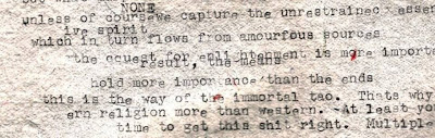


FutureClaw is a really cool mag, from Vermont - USA. What attracts me to this arts/culture/fashion publication, is it's apparent size. I know it's said that size doesn't matter - but come on - it helps. FutureClaw measures a hefty 12 x 15 inches (a normal fashion mag measures 8.5 x 11)and apparently contains pages of luscious glossy high quality paper (I wouldn't know, as I've only read the digital version). I love the concept of a broadsheet arts mag, as I feel it would very much add to the experience. As you can see by the pictures I've added, the layouts are really edgy, incorporating artistically driven shoots, with pages that are pure texture (my favourite). The content is very interesting and progressive.


Speaking of cool magazines, I am really enjoying my internship at Chic Today, I have so much to learn, but I am loving coming up with new ideas each week, and having direction on what I need to do to produce a catchy, well-written article. My second article got published this morning, which is on Le Whif - chocolate you inhale instead of eat!

Wednesday, 8 July 2009

Andrei Robu.


Andrei Robu. Exceptional. Designer and Partner at Acme, design office in Bucharest, Romania (copied from his Twitter account.. I'm such a crafty stalker). When I came across the work of Andrei Robu, I was booowwwlllled over. What gorgeous work. His typography is playful and inventive. There's some stunning work with translucent overlapping colours on his site, like the example above - I recommend viewing it. The examples I selected to show you were.. surprisingly.. my favourite pieces. I could look at them forever - how serene, how delicate, how BRILLIANT. Beautiful use of colour, layering, composition and detail. Andrei - blow your cig on me, I'm yours.


(All images are from the artist's website, as always)
Paris Paris