Tuesday, 4 August 2009

Steven Wallis.


Steven Wallis is a friend of my sisters (though I'm not name dropping!). He won Master Chef in 2007 - but had a background in fashion and branding/design. I have had the pleasure of sampling his culinary delights - he is G.O.O.D. Steven is currently taking a year to travel the world and experience gastronomy from many different cultures, I really hope he's having an amazing time. As well as reading his blog (which you should also read), I like to keep track of his travels by looking at the photos he posts on facebook. I absolutely love Steve's photos, because the one thing you can be sure of is that they will be bursting with colour - really bright and full and lavish. GLORIOUSLY luscious. Even in the foods he snaps (as you can see above). He posts a lot of photos, so it's almost like I'm going on the journey with him -- (while I sit in bed getting repetitive strain injury on this computer) -- the places he's been, I've never seen so much stunning infrastructure and brilliant opportunities for design influenced photography. Here are a few of my favourites, but they really don't represent how many great scenes he's captured.

Saturday, 1 August 2009

facebook foto.

If you say you don't facebook stalk - you are lying. We all do it --albeit it to varying extents. Because I am on course to become the world's greatest procrastination artist, I have been taking time to look at many photos of my fb friends - mainly those that come up in my mini feed. For some time now there have been photos that really catch my eye, and although I am quite clearly breaking some type of privacy policy here, but I thought I'd take a risk and show you some of my favourite photos I've seen on facebook.

Friday, 31 July 2009

Yvonne Niewerth.


German graphic designer, Yvonne Niewerth was the topic of my most recent article for Chic Today. She's come up with the compelling concept of designing 30 different pudding packages for "every kind of pudding buyer" - - as you can see in the image directly above. As you will know if you read my article, this was done on the premise that we purchase in line with our identity, so by giving consumers a range of possible packaging designs, people are more able to express their image. Really interesting stuff, but I'm still unsure whether I think it would ever work - although it's obvious that I think package design is extremely important and more influential on purchases than we're ever conscious of.
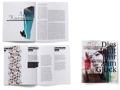
Putting these psychological constructs aside, I did some research into Niewerth's design work, and I really love her stuff. On her portfolio, there's a lot of work on books - really nice type and design within books -- I mean I don't know what these books are about, because my German isn't great (embarrassing memory flooding back, from when I said "ich heisse Tiddles" in German class...incorrect translation obv). I love this layering that can be seen in the web page of the top image. I'm starting to see this more and more - a kind of creative way of showing various examples of work than can be manipulated around the page. I love it. I love her feminine style, with the layering (again), the watercolour-esque tones and blotched textures, and the lovely fine type. I'd say lady-like yet edgy. A style I really am drawn to - - and irrespective of whether I think that having copious amounts of choice in pudding pack aesthetics is a good idea, the designs themselves are brilliant. I've been giving it a great deal of thought.. and I THINK I'd pick the black and white on the second row... or the colourful block type situation next door (even though I'm slightly over that type, it looks SO cool) - - so I wonder what that says about me..

Wednesday, 29 July 2009

Hey.


Heyyyy. I'm sure Hey Design is French? I'd seen their stuff on Typographic Posters, but saw more of their work on lookslikegooddesign. I like it. I like it a lot. Lovely illustrations, connecting and telling a story. I don't know what story.. but I always think that sequences conjoined or in a big interconnected web means that there is a story being told.. does that make sense? The top image is my fav. Great use of colour and I love the symmetry. That's all my brain will permit me to say.

In other news, I'm hoping to get an article published this week for Canvas Magazine which is EXCITING. Aside from that, my life is a dissertation hell -- that i sporadically punctuate with writing, blogging and wine. AND I've started knitting. It's a slippery slope.

Wednesday, 22 July 2009

Dripping in Chanel.


This week, Ariston Anderson wrote an article for Cool Hunting about this lavish stunt. This painted Chanel logo was dripping off the Hong Kong flagship Armani store, by none other than ZEVS - - - as part of his 'Liquidated Logos' show in Hong Kong. Apparently it is to symbolise the war of brands. I'm going to back out of moral/intelligent discussion about the rights or wrongs of this - because my brain can't take it alongside the billion words I have to write for my literature review today. Basically, the reason I am blogging about this is because I think Zevs is very profound and worth talking about, when he does crazy stuff like this, getting fined hundreds of thousands of pounds to make his point, but more so because the Chanel logo is my favourite logo of all time, and always will be. When I got interviewed last summer to do work experience at Pearlfisher, I was asked what my favourite identity was and why. There was no doubt in my mind. CHANEL. Those two interlinking Cs, simple, classic, timeless. But SO much more than that. A logo is a representation of a brand, so I guess without what Coco Chanel created, the logo wouldn't mean the same thing to me. But this impacting logo denotes independence, style, elegance and and the beauty of simplicity.

As much as I'm sure Coco Chanel wouldn't like her logo dripping off and Armani wall, I just thought I'd blog to show what lengths some people to go for their art, and to show my love of Chanel.


Installation, 2007, Zurich.

Tuesday, 21 July 2009

Gotta get you into my life.


Alexander McQueen - stop it.

Sunday, 19 July 2009

Deubal.


Tonight I've been watching a great film called Hors de Prix - or Priceless, featuring Audrey Tautou. I love this film, it's so incredibly chic. It denotes the height of decadence and the fashion is unreal. One thing that makes this film what it is, is the illustration on the credits. I found out tonight that it was designed by Stéphanie Lelong and Olivier Marquézy, of French creative agency Deubal. They have created some really lovely animated illustrations for both TV and film in France, they are all playful but really clever too.

I love the beautiful fine lines in this series of illustrations, and the fluid motion of everything interlinking. The flashes of colour against the monochrome backdrop is fabulous and it's just so elegant and so..French!
Paris Paris