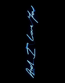
Thanks again Heavy Backpack - for introducing me to the wonderment of Spike Hibberd, a Graphic Designer/Art Director who's stuff is just gorgeous. I absolutely love his typography - so many more examples on his website - really creative and forward thinking, but with the ability to add a retro, and very personal touch to things - and as is said in his bio, he adds a bit of himself to everything he does. There is use of hand written scrawls (in a good way) that make his work look really idiosyncratic. I think his illustrative talent is profound - especially with the Mr Tulk poster. All in all - brilliant work on identity, typeography and general use of colour and illustration. AMAZING.
Wednesday, 22 April 2009
Spike Hibberd.
Thanks again Heavy Backpack - for introducing me to the wonderment of Spike Hibberd, a Graphic Designer/Art Director who's stuff is just gorgeous. I absolutely love his typography - so many more examples on his website - really creative and forward thinking, but with the ability to add a retro, and very personal touch to things - and as is said in his bio, he adds a bit of himself to everything he does. There is use of hand written scrawls (in a good way) that make his work look really idiosyncratic. I think his illustrative talent is profound - especially with the Mr Tulk poster. All in all - brilliant work on identity, typeography and general use of colour and illustration. AMAZING.
Sunday, 19 April 2009
Bee Raw ...Bee autiful!
I was perusing the die line and came across THIS. A graphic design student has produced this for some honey sticks. What a honey stick is, I do not know (presumably a stick made out of honey). The main thing I like is how the student has crafted the packaging to look like honey comb. Its not overt, in the sense that it's not loads of little shapes interlinking, but at the same time it depicts that hexagonal form of the comb. Obviously, using this shape formation draws people's minds to honey, honey comb and so on when looking at the packaging, thus having that wonderful recall of all the glorious honey connotations by simply looking at a box, this is where my Psychology degree comes in handy - a sweeping statement, based on absolutely nothing I learnt. I love the colours, the gloss finish - again, reinforces that honey feel - bringing people's thoughts to the aesthetics and touch of honey. On top of all of this we have a gorgeous white typeface, bold and large across the packaging, with the image of the bee. I much prefer this to the black, as that is quite lost in the busy background. Really like the type not quite fitting and stretching over the surfaces, I think it makes it look really edgy.
Sunday, 5 April 2009
Ideas Factory.
Ideas Factory (London) brand creation - - a luxury travel company, called Carte Blanche. Obviously, when we're talking luxury, gold instantly comes to mind - but the reason I find this concept so attractive, is the use of fine gold against the matte brown. With the meaning of luxury changing, due to the recession, people are wanting more subtle indicators of a high-end lifestyle. They don't want the brassy luxury that once was, as it is deemed inappropriate to flash the cash when less fortunate people are struggling. So, in light of that, I think this is the perfect example of how to say luxury in a diffident way.
Roanne Adams.
WELL. WELL Well well. This New York based designer runs a studio called TriBeCa. When I came across her website, I was just so excited. Look at her stuff!! I had about a billion images saved, but I just stuck to my absolute favourites. I LOVE IT. I just love it. It is SO fresh, and COOL and the use of colour is just so mellow yet effective, and the style is really....innovative and artistically driven. I cant really describe what I mean - I just wish more retail items looked more like this.
Saturday, 4 April 2009
ruiz+company.
Spanish agency have done this package design for chocolat factory. I love it. I think its really impacting, with the bold use of block colour and simplistic type/design. I think this would really stand out amongst competitors and reminds me of some cool and minimalist confectionery design in the UK (look at pic below) and almost as simple as the new design for Tesco Value products, which I actually really like!
/M/A/S/H/
/M/A/S/H/ Australia did the re branding for this fashion online retailer, who sell vintage pieces. I love the typeface of the identity. It's clean, smooth and classic, but with a slight idiosyncricity that adds a slight flair, with the flick of the R. I really like these abstract graphics on the business card. I think it oozes modernity, and edge, whilst maintaining that classic, quality feel - aided by the monochrome style.
Subscribe to:
Posts (Atom)