Tuesday, 25 August 2009

Hideki Inaba


I came across the work of Hideki Inaba when looking at this DOTMOV 2009 film festival logo. Inaba lives and works in Tokyo as a designer and graphic artist. I really like this stuff - the use of colour is really bold, and there are some fluid works which are really cool as it's a great mix of that boldness, with softer textures. Nice illustrative compositions seen in the second image.
I like the DOTMOV logo because it's simple but really stimulating and abstracted. There are so many crap brand/service/event identities out there that are so dated and boring - so I get very excited when I see things like this.

Saturday, 22 August 2009

Callum Nash.


Hi. I don't want to do my dissertation anymore. This masters will be over in just over 2 weeks - and then I may start to feel like a normal human again.
Anyway - on a lighter note - this is the site design of a guy I know called Callum Nash. He does graphic design and also designs a lot of furniture and the types of cool things that go on Dragons Den (in my opinion..) Despite his efforts of invention and other impressive things - I am blogging about his type on his website. So yes - I guess he'd be rather PO'd but I don't care, as I personally think its cool and worth blogging about. SO. I think its really cool how the type is constructed of these little squares - its typography's answer to Lego. Really interesting and clever concept - like the design of the about me, portfolio buttons - and I think it's important to have things that compel at this primal level of the site interaction - as it makes people want to continue and explore! Lovely.

Friday, 14 August 2009

Vexed Magazine.


I have just had my first two music reviews published at Vexed Magazine - it's such a cool digital publication that focuses mainly on music, please read it - it's a really cool mag. My first two reviews were for the new singles by Temposhark and French Horn Rebellion. Already I'm learning so many new bands and styles - it's really cool. If you keep looking you may see pics of me on it too.. as I was physically forced to take pics of myself with a sign saying I Love Vexed.. x

Design Museum. Take Two.


It's disturbing me that it was a whole week ago that I visited the Design Museum.. how the time flies when you're doing your d.i.s.s.e.r.t.a.t.i.o.n.o.f.h.e.l.l. So - tonight I sit here, writing articles, using the soothing tones of D'Angelo as prozac and thinking - I want to go back to London where I can see cool things like the first ever issues of some of the coolest magazines around. Namely i-D and Dazed & Confused. I was so excited to see the exhibition of design through the decades - it was SO interesting. I'm going to write some of my memo pad listings down now - about these cool typographic magazines I saw. P.S. sorry for the ridiculous quality of these photos - the lighting was catching, I was using my Blackberry and I was doing it in super spy mode cos I could feel the people who worked there looking at me - so I thought I was doing something illegal... I later realised that I could have had a whopping 6ft SLR and tripod as long as it didn't have a flash.I'm such a div.


Typographica: The founder of this cool publication was Herbert Spencer. From what I could gather - this journal took typography from every day surroundings and mixed it with really cool layouts and concepts to just be incredible.. this was a quote on the board: "one of the most distinctive visual arts publications of the post war period." It's still the same now . Lush.


Octavo (8v0): another international journal of typography. Founded in 1984 by Mark Holt, Simon Johnson and Hamish Muir. I'm tired, so if you want to know more - read this article by legendary eye magazine.

"For a graphic artist, letters are like bricks for a builder. When I write, I don't write, I draw."

Wednesday, 12 August 2009

ken garland.

A Manifesto - Ken Garland 1963 - Meeting of Society Of Industrial Arts:

We, the undersigned, are graphic designers, photographers and students who have been brought up in a world in which the techniques and apparatus of advertising have persistently been presented to us as the most lucrative, effective and desirable means of using our talents. We have been bombarded with publications devoted to this belief, applauding the world of those who have flogged their skill and imagination to sell such things as cat food, detergent [...] by far the greatest time and effort of those working in the ad industry are wasted on these trivial purposes, which contribute little or nothing to our national prosperity...


When I was at the Design Museum on Friday, I read this manifesto and it really made me think. Obviously there are brands and agencies that don't employ particularly creative individuals to design products, identities, packaging; but there are an awful lot of incredibly talented people doing what Ken Garland deems a waste of talent. Is it a waste of talent? Do people really notice and appreciate artistic ability communicated through detergent packs? Maybe not - but especially in agencies, with the cat food and other boring products, come more interesting projects that really allow creativity to relish (in my opinion). Also - what Mr. Garland doesn't quite seem to grasp, is that we have to survive and have a job - not everyone can succeed being a famous artist/designer/photographer - and I think the industry he casts down is a perfect opportunity to merge design ability and real life. But to be fair to the guy - it was written in 1963, and we have come a long way in terms of branding and the like since then. Anyway - it's certainly food for thought.

Monday, 10 August 2009

Design Museum.


On Friday I went to the Design Museum - which I've been excited about for ages! This time the first exhibition was design through the decades - which I will blog about later, because I want to do some research on some really cool typography publications I've never heard of - which is EXCITING.
This exhibition was named 'Drawing Life' by Spanish artist Javier Mariscal. Mariscal got creative in his twenties - in the 1970s - when he moved to Barcelona, and started his career as an underground comic artist. From this, he experiemented in every realm of creativity, designing everything from furniture and interiors, to clothing and accessories. He's still crossing every confine and producing art through film, ceramics, performance and print in his large studio which reaches out to clients worldwide.
This exhibition was really something else. I love the Design Museum for the way the work is presented in such an elaborate and experiential format. This particular exhibition consists of 13 installations based on how Mariscal views the world. As you enter - you brush through a curtain of wires. The first passage is an explosion of hanging illustrations, mainly faces. I'm quite glad I went alone actually, because there was so much to see, I'm pretty sure I was walking round with my mouth wide open. There were merging of film and illustrated board installations, projections on walls, furniture and textured typographic presentations. It literally makes your brain buzz. My favourite section of the exhibition was Mariscal's animated film played to a Pretender's tune. It was played on small screens under board constructs, and I sat for ages watching it over and over whilst flicking through his sketch book. It was really quirky and witty and really full of life.

Chrissy en France.


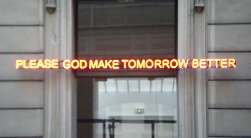
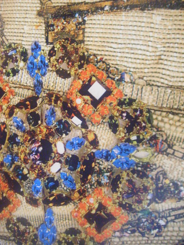
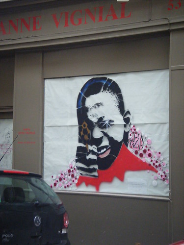
My friend Chrissy has just been to Paris with her boyfriend, and from seeing her photos - I've decided I'm in love with her. Her and her boyfriend are really into photography, and I seriously love these shots. There's so much going on, so much character. Love it.

Tuesday, 4 August 2009

Prim. Aug/Sep.


prim. Magazine just keeps getting better and better - and I am so lucky to be able to write for them. This issue seriously excels itself - the layouts alone are out of this world. The shoots are so artistically driven and so compelling to look at - it helps you to think of fashion in different realms. There are some really brilliant features this issue. I wrote about Ventury's new couture furniture line, named Divine. It was so interesting to write. If you don't read prim. -- then start. It's brilliant.

Steven Wallis.


Steven Wallis is a friend of my sisters (though I'm not name dropping!). He won Master Chef in 2007 - but had a background in fashion and branding/design. I have had the pleasure of sampling his culinary delights - he is G.O.O.D. Steven is currently taking a year to travel the world and experience gastronomy from many different cultures, I really hope he's having an amazing time. As well as reading his blog (which you should also read), I like to keep track of his travels by looking at the photos he posts on facebook. I absolutely love Steve's photos, because the one thing you can be sure of is that they will be bursting with colour - really bright and full and lavish. GLORIOUSLY luscious. Even in the foods he snaps (as you can see above). He posts a lot of photos, so it's almost like I'm going on the journey with him -- (while I sit in bed getting repetitive strain injury on this computer) -- the places he's been, I've never seen so much stunning infrastructure and brilliant opportunities for design influenced photography. Here are a few of my favourites, but they really don't represent how many great scenes he's captured.

Saturday, 1 August 2009

facebook foto.

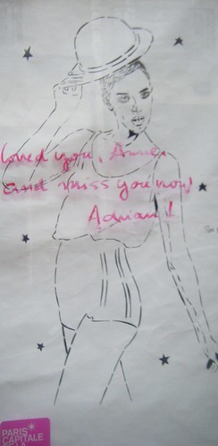
If you say you don't facebook stalk - you are lying. We all do it --albeit it to varying extents. Because I am on course to become the world's greatest procrastination artist, I have been taking time to look at many photos of my fb friends - mainly those that come up in my mini feed. For some time now there have been photos that really catch my eye, and although I am quite clearly breaking some type of privacy policy here, but I thought I'd take a risk and show you some of my favourite photos I've seen on facebook.
Paris Paris