Monday, 14 December 2009
Arturo Sandoval.
Since I've had a bit of a gap from playing my sax, I haven't listened to a lot of jazz. On a youtube sesh I searched for Arturo Sandoval - my band leader was a trumpet player so he always used to tell us about Sandoval. He is an amazing trumpeter - smooth and amazing tone, fast and brilliant improvisation. Love the rhythm in this song - we used to play it in my uni jazz band. WATCH IT.
Saturday, 12 December 2009
Well done richard wright.


I went to the Tate Britain in November to see the shortlist exhibition for the Turner prize. As much as it is an incredible accolate - I'm always scepical of the content of prospective Turner Prize entries. I am not impressed by a shit on a brick, or other likened specimins - as in my opinion, they are not art. I did really enjoy going round the exhibition and I thought all of the artits had grasped something worthy and inspiring - especially after watching the broadcast video from each artits - discussing their motives.
I should have blogged at the time - because then it wouldn't look like I'm lying - but I really DID think Richard Wright should win. I am very interested in textural art - whether it be visual or to the touch. I am also very interested in the idea of fragments and delicacy - which is why I loved Wright's beautifully intricate paintings and hidden placements, in the crevices of infrastructure. I am also a big fan of gold and think that using a medium such as gold leaf really adds to the precious yet fragile nature of his work.
I had written a bit about my trip for a cultural initiative that is starting up in 2010 - so I may as well copy and paste that blurb:
This week I went to the Tate Britain to see the exhibition of the 4 artists shortlisted for the 2009 Turner Prize. Each artist had a distinctive style and interesting meaning behind their work. There was everything from copper sulphate to a shark’s skeleton included in the pieces. Each artist dealt with many materials in truly innovative ways and it was great to look at. My favourite artist was Richard Wright. He creates beautifully intricate geometric wall paintings that often only last the duration of the exhibition, as they are painted directly onto the permanent architecture of the gallery. I like the fact that his work is temporary as it adds to the fragility of these discreet, almost hidden paintings.
As you can tell - I'm a big fan of the term 'beautifully intricate'. I'm not sorry. It shows that art doesn't have to be elaborate and crass to be appreciated. I love the temporary feel to it, as it makes it more precious and I love his general theory behind his work: "There's already too much stuff in the world. And it buys you a kind of freedom. Not having [paintings] come back to haunt you is a kind of liberation. You make something, and a month later it is gone." (taken from The Guardian).
Wednesday, 25 November 2009
alberto seveso.


When I saw Frankmusik's album art, I was really intrigued with the gorgeously original illustrations. Looking on an illustration site the other day, I found who did it - Alberto Seveso.
Reading about him, I found out that he has never studied anything related to graphic design or illustration. I find this really interesting because recently I've been thinking about whether creative talent can be learnt or whether it's innate. Obviously this is proof that you have to have it in you - because his work is not only amazing, but truly inspiring and unique.
He merges black and white photos with beautifully abstracted illustrations - a method called 'sperming'.. I love the way that it almost looks like the body's internals are exposed, showcasing a series of beautiful curves and shapes embodying a plethora of possibilities: organs, bones, veins, flowers, etc. Each human figure is injected with an imaginative burst of visually compelling forms to create something incredibly fresh and I haven't seen anything like this before! Gorgeous! Forza Alberto!
Wednesday, 18 November 2009
Se7en Magazine.

I am very excited to be writing some articles for Se7en Magazine. I really love this publication and it's linked to some really good causes. My first article was concerning the influx of edgy and unique female recording artists Britain has birthed this year. My second article was on the fact that I'm starting to like Jedward... *shudder* and possible theories (psychologically based) as to why that may be the case. Cos it certainly isn't down to their jubliant raw talents, is it!!
Saturday, 10 October 2009
Rob Brandon.
I am writing this post because my friend Rob is about to move to Austria for 6 months to work with Red Bull. He is a music-video-maker, a short-film-creater and an extremely talented person (with good dancing skills thrown in). You HAVE to look at his website -- you can see his brilliant videos here and read his blog. I wish all music videos could look like his - so intricate and creative and thoughtful and clever!
He blogged about this video below yesterday. It's some "unofficial visuals i whipped up for the track 'Hot chick' by Uffie on Ed Banger." I LOVE IT. The way he's used shapes, pulsing, colour, text and the placement of all of these elements on the screen is so completely brilliant. I have a big interest on how you can merge your senses - similar to when I posted about Non Fortmat doing a visual representation of a Nas rap -- this is the same. He's captured what he's heard and turned it into the most vibrant and compelling aesthetic version.
Good luck in Austria, Rob!!! Have a brilliant time and let me know when I'm visiting xxx.
Thursday, 24 September 2009
Jessie J.
Jessie J is absolutely A.M.A.Z.I.N.G. She has supported the likes of Jools Holland and Macy Gray and now she is signed to Universal. Shes outstanding, I can't stress this enough. Her voice is one of my top. Her songs are fantastic and what I love most is that she brings something totally different to the table. Her soulful influences come through to give her such a powerful vibe - she could be jazz, she could be soul, she could be r&b - to be fair she could be anything she wanted. She's worked so hard at getting to where she is - which is commendable but also a little frustrating to see when there's so many people with zero talent waltzing through and getting signed. Jessie J has enough star quality to light up London - keep an eye out for her.
Frankmusik @ G-A-Y 8th August

I was extremely excited to go and hear Frankmusik play at G-A-Y a few Saturdays ago. Everybody loved him, and he had great stage presence. It's always nice when you hear an artist live and it's hard to decipher differences between their live and recorded performance. It seems quite a rarity that singers can actually sing. His vocal range is out of this world and he has a real energy when performing that infects everyone watching him. I remember watching a t4 music show last year with Frankmusik and La Roux, and the presenter awarded La Roux the accolade of 'one to watch' - and although I love what La Roux does, I was very much attracted to Frankmusik. I think his songs are the perfect combination of past present and future. There's obvious synth influences and he gets inspiration from past bands (take, for example, the melodic resemblance to The Stranglers' Golden Brown on his track When You're Around -- my favourite track of the album). With this overt 80s inspiration, Frankmusik catapults his sound to the cutting edge, he's a truly innovative and exciting artist.
I'm very passionate about the talent and potential of this artist - which is why I have to say these next four words: Tim Chester you're vile.
I am all for everyone having their own opinion - but this little sub-human idiot is just unnecessary. Even if you despised a record, there is no way that enough venom could be sparked up in you to create a review of such hatred, so I have to come to the conclusion that this person has a large chip on his shoulder and a tiny penis. I'm not entirely sure why nme allowed this review to be published, but all I can say is that it takes great talent to acknowledge the greatness of retrospective melodies and turn it into something completely original and current. Unfortunately that review was nothing more than the outbreak of an extremely inadequate failed musician.
In conclusion - Frankmusik - keep doing what you're doing - everybody loved you that night and I hope to see you again in the future. ALSO - the album illustration for Frankmusiks' stuff is out of this world - I shall do a blog on the person who did it.
Writing.

Hola. Do you like the pic? It's ME - I seem to have been borderline ginger as a child.. you'd never believe it now! Since finishing my MA I have been doing as much writing as I can - reviewing for Vexed and starting to write some articles that I am enjoying so very much at Canvas - my first published was one on a company specialising in obscure ice cream flavours - hence my picture. ALSO - prim. Magazine is officially available to purchase in print from about 50 stores in London - so I got a copy obviously. It is a major buzz seeing my first article in print!!
Also - I started a poetry blog but shut it down because I find the showcasing of my poetry too shameful to withstand - AND THEN I started a music blog (I'm blogging about music because I can't review unreleased material on Vexed... or at least I don't think I can) - but what I've decided to do is combine the two - so this blog will now cover more than illustration and typography - it will be more of a plethora of pop culture.
Sunday, 13 September 2009
Could Be Me.


Could Be Me is a project including many many artists --- "exploring possibility of one artist occupying another's space. It is a visual adventure and an interpretation of the same sentence by different artists worldwide."
How interesting is this - looking at different artists styles on the same statement - it's hard to compare artists, because they are often inspired by different things and basing their work on different topics and obviously using different mediums and techniques. Here, all of these artists are given the same concept and that's it - and the range is unbelieveable. It's interesting to get into their minds - their use of colour and form is especially interesting. Many have used a picture of a person to illustrate it could be me but it's actually paul paper - but what I find most interesting are the people who haven't done that - like the bottom image by Josh Murfitt - a note on a sofa. Very clinical, no trace of humanity, the note isn't even hand written. It's wonderful to try and think about what his reasoning behind this is.
Images in order of appearance: Alexander Binder, Andrea Shear, Cesar Brun and Josh Murfitt.
Tuesday, 25 August 2009
Hideki Inaba


I came across the work of Hideki Inaba when looking at this DOTMOV 2009 film festival logo. Inaba lives and works in Tokyo as a designer and graphic artist. I really like this stuff - the use of colour is really bold, and there are some fluid works which are really cool as it's a great mix of that boldness, with softer textures. Nice illustrative compositions seen in the second image.
I like the DOTMOV logo because it's simple but really stimulating and abstracted. There are so many crap brand/service/event identities out there that are so dated and boring - so I get very excited when I see things like this.
Saturday, 22 August 2009
Callum Nash.


Hi. I don't want to do my dissertation anymore. This masters will be over in just over 2 weeks - and then I may start to feel like a normal human again.
Anyway - on a lighter note - this is the site design of a guy I know called Callum Nash. He does graphic design and also designs a lot of furniture and the types of cool things that go on Dragons Den (in my opinion..) Despite his efforts of invention and other impressive things - I am blogging about his type on his website. So yes - I guess he'd be rather PO'd but I don't care, as I personally think its cool and worth blogging about. SO. I think its really cool how the type is constructed of these little squares - its typography's answer to Lego. Really interesting and clever concept - like the design of the about me, portfolio buttons - and I think it's important to have things that compel at this primal level of the site interaction - as it makes people want to continue and explore! Lovely.
Friday, 14 August 2009
Vexed Magazine.

I have just had my first two music reviews published at Vexed Magazine - it's such a cool digital publication that focuses mainly on music, please read it - it's a really cool mag. My first two reviews were for the new singles by Temposhark and French Horn Rebellion. Already I'm learning so many new bands and styles - it's really cool. If you keep looking you may see pics of me on it too.. as I was physically forced to take pics of myself with a sign saying I Love Vexed.. x
Design Museum. Take Two.


It's disturbing me that it was a whole week ago that I visited the Design Museum.. how the time flies when you're doing your d.i.s.s.e.r.t.a.t.i.o.n.o.f.h.e.l.l. So - tonight I sit here, writing articles, using the soothing tones of D'Angelo as prozac and thinking - I want to go back to London where I can see cool things like the first ever issues of some of the coolest magazines around. Namely i-D and Dazed & Confused. I was so excited to see the exhibition of design through the decades - it was SO interesting. I'm going to write some of my memo pad listings down now - about these cool typographic magazines I saw. P.S. sorry for the ridiculous quality of these photos - the lighting was catching, I was using my Blackberry and I was doing it in super spy mode cos I could feel the people who worked there looking at me - so I thought I was doing something illegal... I later realised that I could have had a whopping 6ft SLR and tripod as long as it didn't have a flash.I'm such a div.
Typographica: The founder of this cool publication was Herbert Spencer. From what I could gather - this journal took typography from every day surroundings and mixed it with really cool layouts and concepts to just be incredible.. this was a quote on the board: "one of the most distinctive visual arts publications of the post war period." It's still the same now . Lush.
Octavo (8v0): another international journal of typography. Founded in 1984 by Mark Holt, Simon Johnson and Hamish Muir. I'm tired, so if you want to know more - read this article by legendary eye magazine.
"For a graphic artist, letters are like bricks for a builder. When I write, I don't write, I draw."
Wednesday, 12 August 2009
ken garland.
A Manifesto - Ken Garland 1963 - Meeting of Society Of Industrial Arts:
We, the undersigned, are graphic designers, photographers and students who have been brought up in a world in which the techniques and apparatus of advertising have persistently been presented to us as the most lucrative, effective and desirable means of using our talents. We have been bombarded with publications devoted to this belief, applauding the world of those who have flogged their skill and imagination to sell such things as cat food, detergent [...] by far the greatest time and effort of those working in the ad industry are wasted on these trivial purposes, which contribute little or nothing to our national prosperity...
When I was at the Design Museum on Friday, I read this manifesto and it really made me think. Obviously there are brands and agencies that don't employ particularly creative individuals to design products, identities, packaging; but there are an awful lot of incredibly talented people doing what Ken Garland deems a waste of talent. Is it a waste of talent? Do people really notice and appreciate artistic ability communicated through detergent packs? Maybe not - but especially in agencies, with the cat food and other boring products, come more interesting projects that really allow creativity to relish (in my opinion). Also - what Mr. Garland doesn't quite seem to grasp, is that we have to survive and have a job - not everyone can succeed being a famous artist/designer/photographer - and I think the industry he casts down is a perfect opportunity to merge design ability and real life. But to be fair to the guy - it was written in 1963, and we have come a long way in terms of branding and the like since then. Anyway - it's certainly food for thought.
Monday, 10 August 2009
Design Museum.


On Friday I went to the Design Museum - which I've been excited about for ages! This time the first exhibition was design through the decades - which I will blog about later, because I want to do some research on some really cool typography publications I've never heard of - which is EXCITING.
This exhibition was named 'Drawing Life' by Spanish artist Javier Mariscal. Mariscal got creative in his twenties - in the 1970s - when he moved to Barcelona, and started his career as an underground comic artist. From this, he experiemented in every realm of creativity, designing everything from furniture and interiors, to clothing and accessories. He's still crossing every confine and producing art through film, ceramics, performance and print in his large studio which reaches out to clients worldwide.
This exhibition was really something else. I love the Design Museum for the way the work is presented in such an elaborate and experiential format. This particular exhibition consists of 13 installations based on how Mariscal views the world. As you enter - you brush through a curtain of wires. The first passage is an explosion of hanging illustrations, mainly faces. I'm quite glad I went alone actually, because there was so much to see, I'm pretty sure I was walking round with my mouth wide open. There were merging of film and illustrated board installations, projections on walls, furniture and textured typographic presentations. It literally makes your brain buzz. My favourite section of the exhibition was Mariscal's animated film played to a Pretender's tune. It was played on small screens under board constructs, and I sat for ages watching it over and over whilst flicking through his sketch book. It was really quirky and witty and really full of life.
Chrissy en France.


My friend Chrissy has just been to Paris with her boyfriend, and from seeing her photos - I've decided I'm in love with her. Her and her boyfriend are really into photography, and I seriously love these shots. There's so much going on, so much character. Love it.
Tuesday, 4 August 2009
Prim. Aug/Sep.


prim. Magazine just keeps getting better and better - and I am so lucky to be able to write for them. This issue seriously excels itself - the layouts alone are out of this world. The shoots are so artistically driven and so compelling to look at - it helps you to think of fashion in different realms. There are some really brilliant features this issue. I wrote about Ventury's new couture furniture line, named Divine. It was so interesting to write. If you don't read prim. -- then start. It's brilliant.
Steven Wallis.


Steven Wallis is a friend of my sisters (though I'm not name dropping!). He won Master Chef in 2007 - but had a background in fashion and branding/design. I have had the pleasure of sampling his culinary delights - he is G.O.O.D. Steven is currently taking a year to travel the world and experience gastronomy from many different cultures, I really hope he's having an amazing time. As well as reading his blog (which you should also read), I like to keep track of his travels by looking at the photos he posts on facebook. I absolutely love Steve's photos, because the one thing you can be sure of is that they will be bursting with colour - really bright and full and lavish. GLORIOUSLY luscious. Even in the foods he snaps (as you can see above). He posts a lot of photos, so it's almost like I'm going on the journey with him -- (while I sit in bed getting repetitive strain injury on this computer) -- the places he's been, I've never seen so much stunning infrastructure and brilliant opportunities for design influenced photography. Here are a few of my favourites, but they really don't represent how many great scenes he's captured.
Saturday, 1 August 2009
facebook foto.


 If you say you don't facebook stalk - you are lying. We all do it --albeit it to varying extents. Because I am on course to become the world's greatest procrastination artist, I have been taking time to look at many photos of my fb friends - mainly those that come up in my mini feed. For some time now there have been photos that really catch my eye, and although I am quite clearly breaking some type of privacy policy here, but I thought I'd take a risk and show you some of my favourite photos I've seen on facebook.
Friday, 31 July 2009
Yvonne Niewerth.


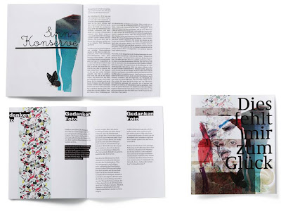

German graphic designer, Yvonne Niewerth was the topic of my most recent article for Chic Today. She's come up with the compelling concept of designing 30 different pudding packages for "every kind of pudding buyer" - - as you can see in the image directly above. As you will know if you read my article, this was done on the premise that we purchase in line with our identity, so by giving consumers a range of possible packaging designs, people are more able to express their image. Really interesting stuff, but I'm still unsure whether I think it would ever work - although it's obvious that I think package design is extremely important and more influential on purchases than we're ever conscious of.
Putting these psychological constructs aside, I did some research into Niewerth's design work, and I really love her stuff. On her portfolio, there's a lot of work on books - really nice type and design within books -- I mean I don't know what these books are about, because my German isn't great (embarrassing memory flooding back, from when I said "ich heisse Tiddles" in German class...incorrect translation obv). I love this layering that can be seen in the web page of the top image. I'm starting to see this more and more - a kind of creative way of showing various examples of work than can be manipulated around the page. I love it. I love her feminine style, with the layering (again), the watercolour-esque tones and blotched textures, and the lovely fine type. I'd say lady-like yet edgy. A style I really am drawn to - - and irrespective of whether I think that having copious amounts of choice in pudding pack aesthetics is a good idea, the designs themselves are brilliant. I've been giving it a great deal of thought.. and I THINK I'd pick the black and white on the second row... or the colourful block type situation next door (even though I'm slightly over that type, it looks SO cool) - - so I wonder what that says about me..
Wednesday, 29 July 2009
Hey.


Heyyyy. I'm sure Hey Design is French? I'd seen their stuff on Typographic Posters, but saw more of their work on lookslikegooddesign. I like it. I like it a lot. Lovely illustrations, connecting and telling a story. I don't know what story.. but I always think that sequences conjoined or in a big interconnected web means that there is a story being told.. does that make sense? The top image is my fav. Great use of colour and I love the symmetry. That's all my brain will permit me to say.
In other news, I'm hoping to get an article published this week for Canvas Magazine which is EXCITING. Aside from that, my life is a dissertation hell -- that i sporadically punctuate with writing, blogging and wine. AND I've started knitting. It's a slippery slope.
In other news, I'm hoping to get an article published this week for Canvas Magazine which is EXCITING. Aside from that, my life is a dissertation hell -- that i sporadically punctuate with writing, blogging and wine. AND I've started knitting. It's a slippery slope.
Subscribe to:
Comments (Atom)


