


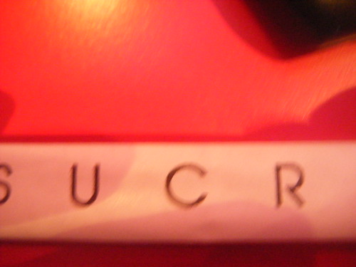
Simon Bent, I like your style. I really really do love looking at this. This typography, named 'Hoax' is, and I quote, "an exploration of modern/western typeface". It's quite interesting to get the fine line of the type, with graphic additions, which add a boldness. The colours used here have a lot to do with my attraction. Really gorgeous use of colour - obviously fitting with the heart theme. As is evident, I'm driven by typography that really goes towards illustration, with intricate (a word I use a lot) detail. I love the O and the Q in the set - it's weird, but I almost feel like they are extra-circular. I find work like this very refreshing and original - I am getting really bored of blocked out type -- that in the strain of stencil etc. I did love it, but it's been used so many times, and it's really nice to see something pushing the boundaries in other directions.


No comments:
Post a Comment